Tuesday, 17 May 2011

Final Album cover - Front and Back covers


Front Cover:
For my front cover I chose to take it during the day because of all the different bright colours I was using and I wanted them all to stand out. Also I wanted the graffitt to show up on the wall as I feel this adds effect to the image. I chose to have the writing in white as there is a lot off colours in the photo and I didn't feel that black or any other colour would stand out that well on this image.


Back Cover:
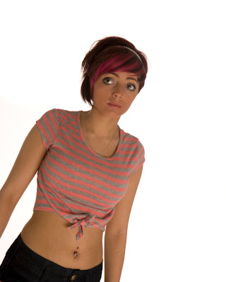
For my back cover I chose to take it at night because I didn't want anything else to distract the views eye. I got my model to wear light coloured clothes so that it would stand out against the dark background. I positioned my model in quite a well known pose which is flattering to enhase the sense of glamour. I turned this image black and white on photoshop because I didn't want it to be so much in your face as it is the back cover and it doesn't need to stand out as much as the front cover does as is what attracts your eye. I chose to use red writing for the name off the songs as these need to stand out to the view because it tells them what is on the CD.

Ideas and changes to album cover

For my original idea I was going to take a photo of just my models face and have with dots on and writting saying things like: pull, lift and plumb. This was to represent my model having a face lift, this would fill one half of the front cover and underneath I would have a pic of the model after its all be done. This would have been done using photoshop. When I tried to do this idea I came across some difficulties and I found that my idea didn't work out the way I wanted it too because of this I decided that I would change my idea and do something else.
For my new idea I am going to use the same model but the front cover will be one stereotype and the back cover will be another stereotype of groups of people which are around today. I wanted to do this to show different personalities and peoples views can change. I made the back cover look like a stereotype of a new york girl for example thin, make up and fashion clothes. For the front cover I want to make it look completely different for example graffitted walls colourful and bold make up.

Wednesday, 4 May 2011

What is Workflow?

Workflow is a sequence of steps which have to be followed in order as it is an operation/organization for stuff to follow in a  sequence.
Workflow may be seen to control situations. Workflow can be described as a document that is being transferred from one step to another.
A workflow is a pattern of activity which is control by a systematic organization of resources, defined in roles and mass, energy and information flows, into a work process that can be documented and learned.
Workflow is designed to achieve processing of work and to make sure that it is done in the correct order and so that everything gets done.

Using a Flatbed scanner

To start off you will need to click on the start menu, then go windows fax and then scan. Once you have done this it will load up as it shows below.

Then click on the new scan button and then a new window appears after that click scan.
Once you click scan the scanner will scan the image which is in the scanner, once it has completed scanning you can then save the scanned image to your computer.

Tuesday, 3 May 2011

Mixed media using line drawing


First you need to open up your image in photoshop, then you need to double click on the background to make it just a layer. Once you have done that duplicate the layer so there are three and they are all the same.


select the top layer, then change the blend mode to colour dodge. which is on the right hand side just below the layers tool. shown in the print screen below.


Next go to the tool bar at the top and scroll along to image click on it, then go down to adjustments, then to invert. This may turn your image white.


Once you have this then go to the top tool bar are scroll along to filter go down to blur then click on gaussian blur. The amount of blur you need will all depend on the picture you are using.


After you have done that go to the tool bar on the right hand side go down to the bottom click on the circle which is half black and half white and change the saturation to -100 then you need to print this image and colour it in.


Once I had coloured in my photo I scaned my image back onto the computer. The image below is the result i got from it.

After I scanned my image I put it into photoshop to merge with the oringinal photo to create the line drawing image. To do this i uploaded both photos onto photoshop and drag the drawing on top of the photo, then i lined them up. Once I done this I went to the the tool bar on the right hand side and scrolled down to the layer tool and changed the type from normal to overlay.


How to use a selection tool and using paths

To make a selection using the paths you need to create a path to do this load your photo up on photoshop and go to the tool bar on the right hand side. where it says layers change it to paths and go to the bottom to the icon which says create new path and click on it to creat your path, just like have with image below.


Next you need to click on the selection tool which on the left hand side on the tool bar. Once you have done this select the area you wish to select/make a path, as I have done below.


If you wish to see just the selection you have made go to the tool bar on the right hand side, click back onto layers and where should be a smaller image off your photo, it will say background if you change it to layer. Then click on the eye which is next to it and this will take away the image by leaving the selection that you have made. This is what i have done as you can see from my print sceen below.

Wednesday, 27 April 2011

Digital Artist - Loretta Lux

I was looking on Loretta's website at her gallery section and I have chosen the best four which I like the most.

When looking at Loretta's photos I noticed that they were all very similar, in these photos it looks like she has taken a photo of the two boys and added them to this draw background. this background could have been draw on photoshop and then be two baby have been added to this after. making it look like it has all be draw this gives the image a unusal effect.


I like this photo off Loretta's because i like the way she has got the drawing as the backdrop and she adds the model to it. Also in this photo it looks like she has changed the models hair as it doesn't look real. The interesting thing about this is that you will not known whether it is the models hair or not as because it is only a photo and it doesn't have any writing with it to discribe it.

I like the composition in the photo because the sleepy child draws your eye in and then you look along the desk, even through this photo is quiet plan with not much going on it still tells a story. With this photo it leaves it to your own thought as there is nothing in the photo to give the real meaning behind it, it looks like the girl is in a unform which could be her school unform, also because you can't see anything apart from the wall and a desk is she at school or is she at home?

Digital Artist - Roy Ascott

I was looking on Roy's website with had his gallery off loads off his digital work and I have chosen the best three which I like the most.

I chose to look at Roy's images because they aren't like the other digital artist that i have looked becuase Roy are more cartoon and full off bright colours and look very fake. For example in this image the sun is a cherry and there is a rock floating. On the rock there is a cube with a paint brush in, when i see this it looked to me as if that was they paintbrush which has colour this image in with different colours.

I think this photo off Roy's is interesting because it is all iced over with snow and in the water there is some flowers, i think this is interesting because the rest off the image is either white off blue and in the middle is there are these flowers which are green and red which stand out as these are the only thing which are differently coloured in the photos.

This photos of Roy's is my favorite because i like the way the shapes are coming out off the sea and they have a mattic look to them and they have reflections in the of the sea and all the other shapes, this give it texture to depth off field to this image making it more interesting to look at.

Digital Artist - Ryan Bliss

I was looking on Ryan's website at all his illustrations and I have chosen the best five which I like the most.

I like this photo off Ryan's because I like the way the sun beams come through the trees and the colour off sky really stands out as its a strong orange colour with some parts being red. The way this image has been taking the sky is very vibrant and the trees and all the other surrounding objects are dark almost black. This adds contast to this image and it makes it interesting to look at.

This photo of the fireworks caught my eye because the sky is black and there are all these colourful fireworks going off and there is a reflection down the bottom off the page this can be cause by reflection in water. I think this is amazing how Ryan managed to capture all off these fireworks goin off in mid air and with some going up. Trying to capture fireworks can be very hard as it will be dark so you will need a slow shutter speed, so you will need a tripod to make sure you don't get camera shake.

I thought this image of Ryan's is interesting because it's off some wild mushrooms and he has changed the colours and added a glow around the edges of the mushrooms which make them stand out even more. The way that Ryan has edited this image it looks like it was taken at night and it is really interesting that you can't see anything else apart from the mushrooms and they look like they are on a hill/mound.

This photo off Ryan's caught my eye because it is different to all off the rest off his work as he mainly captures wildlife, landscapes or anything out doors. You have to look closely at this picture to see what is going on because at first i didn't notice the cork screw was hugging the wine bottle, you only notice this by looking closely. Also the reflection on the glass table has been made blurly the only part which hasn't been is the reflection off the cork.

I feel this image is powerful because of the way it has all be set and taken, with the dark clouds, the tower with a light on but it doesnt't seem to have a way in or out off the tower and all the birds flying round the tower this all helps to add effect to the photograph.

Tuesday, 26 April 2011

Transparency film

I decided to try out a different film which i haven't used before, I chose to use a transparency film as i haven't used a colour film before, I used this film in the college studio.
This images haven't been edited yet this is how I took them.


Project ideas

For this project I will be using my nikon D80 to take all my photos. I will be using natural lighting for the sun or to add a bit of light I will just use the pop up flash on my camera. For my album cover I will be using my sister as a model, I will be taking some pictures during the day and some as it is getting dark, I am doing this to show the difference in personalities that people can have. For example they are one person during the day and another at night, I am also showing the difference types off stereotypes that there are. This is a big thing in America so I thought this would be good to show this on the album cover I am designing as it is called new york dolls. for my photo shoot during the day I will find a location which as graffit on the wall and some rubbish around and for the photo shoot just as it is getting dark i will use a location with grass, bushes and tress around so that the too are the complete oposite which is the effect I am after.
For the front and back cover i won't be using any props i will jus have my model, for the inside book I will be photographing make-up like masscra, foundation, blusher, eye liner ect.

Monday, 25 April 2011

Truptych


File size and Resolution

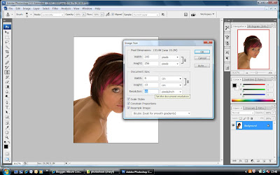
To change the image size or the resolution size go to the tool bar at the top and click on image, scroll down to image size and click onto it. Once you have clicked onto it a box will come up with all the measurements and you can change the resolution which i have done to my image, or you can change the pixel size or the image size.


If you change the resolution to a much smaller number your image will become very pixeled, which are the blocks of colours that your images is made up off.
If you change the size off your image and blow the image up bigger the same thing will happen as you are stretching the image. These both will effect your image and sometimes it can make them look blurred and distorted., but this can be handy as if you wish to put your images onto a webpage or email them you have to change the resolution to quite a small one so that it doesnt take up to much room.

Using Quick Mask

The quick mask tool is good for when your editing your photos because it gives you better control over the areas you have selected.
To make a selection using the quick mask, press the Q key or select the quick mask icon on to tool bar.
You can preview and edit a selection in quick mask, the selection is a transparent pink colour. This helps you to see what parts you have selected and what you still need to select or even unselect.
The area which has been selected will not be effected as it has been marked, but you can edit this area by inverting your selection, this will mask off everything outside the orginal selection.

Sunday, 24 April 2011

Cropping, Resizing and Rotaing images

Cropping

To crop an image you will need to go to the tool bar down the left hand side, click on the crop tool which is the fifth one down (the one which is highlighted). Then you click on the area and hold the left button on the mouse and to get the crop you want drag the mouse across the area and let go when your done. To make the crop press the enter button.


Resizing

To resize your image, go to the top tool bar and click on image, scroll down to image size and click on it. once you have clicked on it, it will bring up a box with the measurements and you can change it to the size you want as shown in the photo below. This also allows you to change the resolution of the image which is the pixel size of an image.


Rotaing

To rotate an image so that it is up the right way or at an angle slightly, you needed to go to the tool bar at the top and click on image. Once you have done that scroll down too rotate canvas, it will then give you different options of how you can rota you image these options are; 180, 90cw, 90ccw and Arbitrary. Arbitrary allows you to put in the angle of how much or how little you wish to rotate the image.

Friday, 22 April 2011

Graphic pen


To create the graphic pen effect select a photo you want to use. I have chosen this image below to add the filtler graphic pen onto. The first thing you need to do is open the photo up into photoshop.


To find this filter you go onto the same setting as you would for the diffuse glow, click on filter and scroll down to sketch and then click on Graphic pen. The graphic pen also gives you the option to change and make the effect how you want it like the diffuse glow does.

this is my example of the graphic pen.

Diffuse Glow

To create the Diffuse glow select a photo you want to use. I have chosen this image below to add the filtler diffuse glow onto. The first thing you need to do is open the photo up into photoshop.

Once it is uploaded go to the tool bar at the tool and click on Filter then go down to Distort and click on the first one which is Diffuse glow, which gives this soft effect onto your image.


After you have clicked on the diffused glow it will bring up the option which is below, this allows you to alter the amount off glow, graininess and how clear it is. once you have got the glow how you want just click ok and then save you image.


This is my example of diffuse glow.


Using RAW

I took this photo on my Nikon D80 using the digital format RAW. To open this image on a computer you need photoshop, once you open your image on photoshop it will come up like the image below. This then gives you more freedom to alter your photo, for example you can edit the exposure, blacks, brightness and many more. These setting do the same as what they would if you was to change the setting on your camera at the time of taking them. by using this you can save an image if it is slightly too dark or too bright as it doesn't effect the quality of the photo.

Friday, 25 March 2011

Jpeg, tiff, psd, raw and png

JPEG files are small, good quality and compatible with pretty much every peice of hardware and software in the world. JPEG files are compressed to make them easier to store or to be transferred, by this compressing the file you will lose quality depending on the level of compression.
JPEG - positives
            compressed to small files, less room, quick to copy and open on any computer
            negatives
            lossing format, lose quality

                    
TIFF files are larger than JPEGs because of this the files are a higher quality. TIFF files can also be saved with layers which can be created on photoshop and saved, so when you re-opened that file all the layers will still separate and you will be able to carry on and edit them.


BMP files are generally uncompressed and retain all the image information of the original copy, but this file   cannot save layers..


PNG files were created for internet display, Like TIFF files they compression the file but not much so the file size will still be large, and like GIF files which PNG was created to replace can store animation information.


RAW files are used when taking an actual photo, and as the name says it saves the raw image you have just shot so during editing you can do anything to it for example: blown out highlights or dark areas can be retained as the data in those parts have been saved with some detail even though they are not visible at first. RAW files are much bigger than jpeg, you have to use special software for opening and editing RAW files, such as photoshop.

Monday, 17 January 2011

Other Album Covers

For my research I decided to research some existing album covers which have already been in the charts to give me some idea off successful albums and what the front cover looks like to help me with my ideas.  To find some off the most recent albums cover or the most popular ones i typed into google images the top 40 albums and I chose three off them to write about.


I chose this album to look at first because it is very simple it shows a member off the band on stage this photo could have been taking whilst they where on stage performing, the writing on this album cover is very bold and plan but it stands out and catches your eyes as the name off the album cover is in colour and the rest is in black and white.


I like this album cover because it is in your face and bold which will catch your eye and you would likely remember this cover than the one above, as the one above it very plan. With this album cover it looks fun and interesting it will make you wondered what the songs are like on it if you haven't heard any off them before.


I like this album cover of Christina Aguilers even through it is literal, i think it is vey different to other peoples album cover. This makes it stand out as it different and if u was to see it on a shelf in a shop you would stop and look at it because it draws you in and it is very different to what Christine Aguilers normal does.